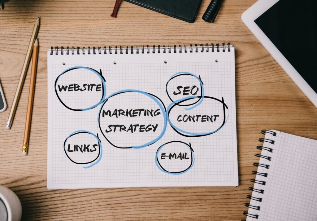
How to Write Abandoned Cart Emails That Convert: 7 Proven Examples Breakdown

Most abandoned cart emails are boring, generic, and ignored. Yet when you actually break down the ones that work, you find clear patterns in subject lines, copy structure, and send timing that anyone can copy. In this post, we tear down 7 real abandoned cart email examples, explain why each one converts, and give you swipeable copy you can adapt to your store this week. No fluff, no “best practices” lists you’ve already read ten times. Just real teardowns and concrete copy. What an abandoned cart email actually is (quick refresher) An abandoned cart email is an automated message triggered when a shopper adds items to their cart but leaves without completing the purchase. The job of the email is simple: remove the friction or doubt that made them leave, and bring them back to checkout. Industry benchmarks in 2026 still show that a well built abandoned cart flow can recover between 10% and 30% of lost carts. That’s free revenue sitting in your ESP waiting for you to turn it on properly. The anatomy of an abandoned cart email that converts Before the teardowns, here is the structure that shows up again and again in the top performers: Subject line: curiosity, personalization, or low pressure reminder. Never “You left something in your cart!” Preheader: extends the subject line, never repeats it. Hero: the product image, large and clickable. Body copy: one job per email (remind, reassure, or incentivize). CTA: one primary button, action verb, above the fold. Trust block: reviews, return policy, or shipping reassurance. The 3 email sequence that beats single sends One email is not a flow. A proper abandoned cart sequence usually looks like this: Email Timing Job Incentive? Email 1 1 hour after abandon Helpful reminder No Email 2 24 hours later Handle objections, add social proof Optional (free shipping) Email 3 48 to 72 hours later Last chance + urgency Yes (discount or bonus) 7 abandoned cart email teardowns 1. Casper: the “come back to bed” angle Subject line: “Did you forget about us?” Why it works: It’s playful, on brand, and reads like a human wrote it, not a marketing robot. It avoids triggering spam filters loaded with “cart” and “buy”. Copy structure: short headline, one cheeky line of body copy, big product image, one CTA button (“Return to cart”). That’s it. No discount, no pressure. Swipe this for your store: Subject: Did you forget about us?Body: Your cart is feeling a little lonely. We saved your favorites just in case you want to give them another look.CTA: Return to my cart 2. Whisky Loot: the funny soft sell Subject line: “Your cart is sobering up.” Why it works: Brand voice carries the whole email. It feels like a friend texting, not a brand selling. Humor lowers the guard. Copy structure: a paragraph of jokes, then product reminder, then a clear button. They also add FAQs at the bottom to remove last minute objections about shipping, returns, and quality. Takeaway: if your brand voice is strong, use it. Generic “complete your purchase” copy is a wasted opportunity. 3. Dollar Shave Club: the value reminder Subject line: “Forget something?” Why it works: Two words, curiosity, no pressure. The body then reminds the reader why they wanted the product in the first place, listing 3 benefits with icons. Copy structure: Hook (“Your cart is waiting”) 3 bullet benefits with icons Product block with price CTA: “Finish my order” FAQ block (shipping, cancellation) 4. Rudy’s Barbershop: minimalism wins Subject line: “Don’t leave us hanging.” Why it works: One headline, one image, one button. Total reading time: 4 seconds. Mobile users decide in seconds, and Rudy’s respects that. Lesson: if you can’t beat a 4 second email, you’re overdesigning. Test stripping your template to bare bones. 5. Adidas: objection handling with social proof Subject line: “Sorry to hear about your Wi-Fi.” Why it works: Brilliant pattern interrupt. It assumes the reader had a technical issue, not buyer’s remorse. That subtle reframe removes guilt. Copy structure: the email then drops 3 customer reviews of the exact product abandoned. Social proof at the moment of doubt is one of the highest leverage moves you can make in email 2 of your flow. Swipe: Subject: Sorry to hear about your Wi-FiBody: We assume that’s why you couldn’t finish checking out. Here’s what other customers said about the [Product Name] you were eyeing.(3 reviews + CTA) 6. Huckberry: the urgency play (done right) Subject line: “Going, going, almost gone.” Why it works: Real scarcity beats fake countdown timers. Huckberry uses limited inventory copy because they actually run small batches. Don’t fake this, customers can smell it. Use this in email 3 when you’ve earned the right to push. Pair with low stock indicators if your data supports it. 7. Chubbies: the last chance discount Subject line: “OK fine, here’s 10% off.” Why it works: It’s self aware, feels like a concession from a friend, and the subject line tells the whole story. Open rate goes up because the value is in the inbox preview. Important: only offer a discount in the final email. If you give 10% off in email 1, you train your list to abandon carts on purpose. Subject lines that consistently beat the average Based on the teardowns above and patterns we see across hundreds of ecommerce accounts, these subject line formulas are the safest bets: “Did you forget about us?” “Still thinking it over?” “Your [Product Name] is waiting” “Quick question about your order” “Sorry to hear about your Wi-Fi” (pattern interrupt) “OK fine, here’s [X]% off” (email 3 only) Avoid: ALL CAPS, multiple emojis, the word “cart” repeated, and anything that screams “automated”. Timing: when to send each email in 2026 Send times have shifted slightly as inboxes get more crowded. Here is what we see working today: Email 1: 1 hour after abandonment. Any sooner feels creepy, any later loses the warmth. Email 2: 22 to 26 hours later. Aim to hit the same
How to Set Up Remarketing Audiences in Google Ads: A Step-by-Step Walkthrough

How to Set Up Remarketing in Google Ads: A Beginner’s Walkthrough If you’re already running search campaigns in Google Ads but haven’t activated remarketing yet, you’re leaving a huge slice of revenue on the table. Most visitors don’t convert on their first visit. Remarketing is what brings them back, and the good news is that setting it up takes less than 30 minutes once you know exactly where to click. This guide walks you through the entire process: installing the remarketing tag, creating your first audience, segmenting visitors intelligently, and launching a campaign that actually performs. No jargon, no skipped steps. What Is Remarketing in Google Ads? Remarketing (also called retargeting) lets you show ads to people who have already interacted with your website, app, or YouTube channel. Instead of paying to acquire a brand new visitor, you re-engage someone who already knows you, which typically lowers cost per acquisition by 30 to 50 percent. Google Ads supports several remarketing types: Standard remarketing: ads shown on the Google Display Network and search partners. Dynamic remarketing: ads showing the exact products or services a user viewed. RLSA (Remarketing Lists for Search Ads): bid adjustments for past visitors searching on Google. Video remarketing: ads served on YouTube. Customer list remarketing: targeting your CRM emails through Customer Match. Before You Start: What You Need An active Google Ads account with billing enabled Access to your website’s code or to Google Tag Manager A privacy policy disclosing the use of cookies and remarketing At least 100 active visitors over 30 days for Display, or 1,000 for Search (RLSA) Step 1: Install the Google Ads Remarketing Tag The remarketing tag is the small snippet of code that drops a cookie on visitors so Google can recognize them later. Option A: Install via Google Ads Directly Sign in to Google Ads. Click the Tools icon in the left menu. Under Shared Library, click Audience manager. Select Your data sources on the left. In the Google Ads tag card, click Set up tag. Choose whether to collect standard data only, or specific attributes for dynamic remarketing. Copy the generated tag and paste it between the <head> tags of every page on your site. Option B: Install via Google Tag Manager (Recommended) Open Google Tag Manager and select your container. Click New Tag > Tag Configuration > Google Ads Remarketing. Enter your Google Ads Conversion ID (found in Audience manager). Under Triggering, choose All Pages. Save and click Submit to publish the container. Tip: Use the Tag Assistant Chrome extension to confirm the tag fires correctly before moving on. Step 2: Verify the Tag Is Collecting Data Go back to Audience manager > Your data sources. After 24 to 48 hours, you should see the status switch to Active with a count of users captured. If the status remains No recent activity, check that: The tag is on every page (not just the homepage) Your consent banner is not blocking the tag for all users You’re not testing in incognito or with an ad blocker Step 3: Create Your First Remarketing Audience In Audience manager, open the Your data segments tab. Click the blue + button and select Website visitors. Give the segment a clear name, for example: All Visitors – Last 30 Days. Choose a list members rule (who qualifies). Set the membership duration (max 540 days, default 30). Click Create segment. Step 4: Segment Smarter, Not Bigger A single “all visitors” list is fine to start, but the real performance lift comes from segmentation. Here are the audiences every beginner should build: Segment Name Rule Duration Use Case All Visitors URL contains your domain 30 days Broad awareness retargeting Product Page Viewers URL contains /product/ 14 days High intent push Cart Abandoners Visited /cart but not /thank-you 7 days Recover lost sales Past Buyers URL contains /thank-you 180 days Cross-sell or exclude Engaged Readers Visited blog + 2+ pages 60 days Lead nurturing Pro tip: Always exclude past buyers from acquisition campaigns to avoid wasting budget. Step 5: Build Your Remarketing Campaign In Google Ads, click Campaigns > + New campaign. Choose an objective: Sales, Leads, or Website traffic. Select Display as the campaign type (or Search if you’re doing RLSA). Set your geographic targeting, language, and daily budget. For beginners, 10 to 25 USD per day is enough to gather data. Under Audience segments, click Browse > How they have interacted with your business > Website visitors, then pick the segment you created. Upload responsive display ads: 5 headlines, 5 descriptions, square and landscape images, plus your logo. Save and launch. Step 6: Set Up Dynamic Remarketing (Optional but Powerful) If you sell products or services with a feed, dynamic remarketing shows users the exact items they viewed. To enable it: In Audience manager, edit your tag and toggle Collect specific attributes for personalized advertising. Choose your business type (Retail, Travel, Education, Jobs, etc.). Implement the additional event parameters (ecomm_prodid, ecomm_pagetype, ecomm_totalvalue) on relevant pages. Upload your product feed in Google Merchant Center or Business data. Link the feed to your dynamic remarketing campaign. Step 7: Monitor, Optimize, Scale Frequency capping: limit impressions to 3 to 5 per user per day to avoid ad fatigue. Bid adjustments: raise bids on cart abandoners, lower them on cold visitors. Refresh creatives every 4 to 6 weeks. Banner blindness is real. Watch the view-through conversions column, not just last-click metrics. Common Mistakes Beginners Make Using a single audience with 540-day duration (too cold) Forgetting to exclude converters Running the same creative for 6 months Not respecting consent rules in regions with GDPR or similar privacy laws Setting budgets too low to exit the learning phase FAQ How long does it take for a remarketing list to be usable? Display lists need a minimum of 100 active users in the last 30 days. Search (RLSA) lists need 1,000. Most sites with steady traffic hit these thresholds within a week. What’s the difference between remarketing and retargeting? They’re the
Screaming Frog vs Sitebulb: Which Technical SEO Crawler Is Right for You in 2026
Screaming Frog vs Sitebulb: Which Technical SEO Crawler Is Right for You in 2026? If you work in technical SEO, you have almost certainly used or at least heard of Screaming Frog and Sitebulb. Both are powerful website crawlers designed to help you audit sites, find issues, and improve organic performance. But they are not the same tool, and choosing the wrong one for your workflow can cost you time and money. In this guide, we break down the real differences between Screaming Frog and Sitebulb across features, pricing, usability, reporting, and ideal use cases so you can make a confident decision in 2026. Quick Overview: What Are These Tools? Screaming Frog SEO Spider Screaming Frog is a desktop-based website crawler that has been an industry standard since 2010. It crawls websites much like a search engine does, collecting data on URLs, response codes, meta data, directives, links, images, JavaScript, CSS, and more. It is known for speed, flexibility, and depth of raw data. Sitebulb Sitebulb launched in 2017 as a more visual, user-friendly alternative to traditional crawlers. It is available as both a desktop application and a cloud-based version, which gives it a deployment advantage. Sitebulb focuses heavily on actionable hints, prioritized recommendations, and built-in education that explains what each issue means and how to fix it. Feature-by-Feature Comparison Feature Screaming Frog Sitebulb Deployment Desktop only (Windows, macOS, Linux) Desktop + Cloud Crawl Speed Very fast; lower resource usage Moderate; can be resource-heavy on desktop JavaScript Rendering Yes (Chromium-based) Yes (Chromium-based) URL Limit (Free) 500 URLs No permanent free tier (14-day trial) Visualizations Basic charts; crawl maps via third-party Rich built-in visualizations and crawl maps Actionable Hints Raw data; interpretation is up to you Prioritized hints with severity and explanations Built-in Education Limited (external docs) Extensive; each hint links to guidance Reporting CSV/Excel export; crawl analysis tabs PDF reports, white-label, shareable links (cloud) API Integrations Google Analytics, Search Console, PageSpeed, Ahrefs, Majestic Google Analytics, Search Console, Chrome UX Report Custom Extraction XPath, CSS Path, Regex XPath, CSS selectors Structured Data Validation Yes Yes Scheduling Crawls Via command line / task scheduler Built-in scheduling (cloud version) Crawl Comparison Yes (compare previous crawls) Yes (built-in change detection) Pricing Breakdown (2026) Both tools offer competitive pricing for what they deliver, but the pricing models are different. Plan Screaming Frog Sitebulb Free / Trial Free version (500 URL limit, reduced features) 14-day free trial (full features) Entry Paid Plan Approximately £199/year per license Desktop Lite from around £11/month; Cloud plans from around £30/month Higher Tier Bulk license discounts for 5+ seats Desktop Pro and Cloud Pro plans with higher crawl limits Billing Annual Monthly or Annual Note: Pricing changes frequently. Always check the official Screaming Frog pricing page and Sitebulb pricing page for the most current numbers. Key takeaway: Screaming Frog is a single annual fee with unlimited crawls and URLs. Sitebulb’s cost scales depending on whether you pick desktop or cloud, and how large your crawl limits are. For solo consultants on a tight budget, the Screaming Frog free version is hard to beat for basic audits. Ease of Use This is where the two tools diverge the most. Screaming Frog The interface is data-dense. Think spreadsheets, tabs, and filters. It assumes you already know what you are looking for and how to interpret the data. There is a learning curve, especially for junior SEOs or those new to technical audits. Once mastered, it is extremely fast for power users who want granular control. Sitebulb The interface is visual and guided. Dashboards surface the most critical issues first. Every hint comes with an explanation, a priority score, and guidance on how to fix it. It is significantly easier for beginners or team members who are not technical SEO specialists. The cloud version adds the convenience of running crawls without tying up your local machine. Verdict on ease of use: Sitebulb wins here, especially for agencies that need to onboard new team members quickly or hand off reports to clients who want to understand the findings without a phone call. Reporting Capabilities Reporting is a critical differentiator, particularly for agencies. Screaming Frog Reporting Exports data primarily as CSV or Excel files. You can generate crawl overview reports and specific issue reports. For polished client reports, you typically need to move the data into Google Sheets, Data Studio (Looker Studio), or a custom template. The tool is built for analysis first, presentation second. Sitebulb Reporting Generates beautiful PDF reports directly from the tool. Reports can be white-labeled with your agency branding. The cloud version lets you share interactive reports via a link, which is excellent for remote collaboration. Reports include visual charts, crawl maps, and prioritized action items with no extra formatting needed. Verdict on reporting: Sitebulb is the clear winner if client-facing reports are a big part of your workflow. Screaming Frog is fine if you process data internally and build your own reporting pipeline. Crawl Speed and Performance Multiple independent tests and community discussions (including threads on Reddit) consistently point out that Screaming Frog is faster and less resource-intensive than Sitebulb’s desktop version. If you regularly crawl sites with hundreds of thousands or millions of pages, Screaming Frog handles the volume more efficiently on the same hardware. Sitebulb’s cloud version mitigates the local resource issue since the crawl runs on Sitebulb’s servers, but this comes at a higher price point. Integration Ecosystem Screaming Frog has a broader range of native API integrations. Connecting to Ahrefs, Majestic, Google Analytics 4, Google Search Console, and PageSpeed Insights directly within the tool means you can enrich crawl data without leaving the interface. Sitebulb integrates with Google Analytics, Search Console, and Chrome UX Report data, which covers most use cases. However, for backlink data or third-party SEO metrics at the URL level, you may need to export and merge data manually. Who Should Use Screaming Frog? Experienced technical SEOs who want raw data and full control over how it is analyzed. Large-scale crawls where speed
Website Design for Construction Companies: 10 Features You Need to Win More Clients

Website Design for Construction Companies: Why It Matters More Than Ever If you own or manage a construction company, your website is often the first thing a potential client sees. Before they ever pick up the phone or request a quote, they are scrolling through your site, judging your work, and deciding whether you look trustworthy enough to handle their project. The problem? Many construction company websites are outdated, slow, or missing the key elements that turn visitors into leads. In a competitive market, a generic template or a basic one-page site simply will not cut it anymore. This guide breaks down the 10 essential website design features for construction companies that help you generate more inquiries, build credibility, and ultimately win more clients. Whether you are planning a brand-new website or a complete redesign, this is your practical roadmap. What Makes Construction Websites Different? Construction websites have unique requirements compared to other industries. Your potential clients want to see proof of quality work, understand exactly what services you offer, and know whether you operate in their area. They also want to feel confident that you are licensed, insured, and experienced. That means your website design needs to prioritize: Visual proof of completed projects Clear service and location information Easy ways to get in touch, especially on mobile devices Trust signals like testimonials, certifications, and awards Let us dive into each feature one by one. 1. A Professional Project Gallery With High-Quality Photos Nothing sells construction work like real photos of real projects. A well-organized project gallery is the single most important design element on a construction company website. What to include in your project gallery: Before and after photos for renovation and remodeling work Categorized projects (residential, commercial, industrial, etc.) Brief project descriptions with scope, timeline, and location High-resolution images that look sharp on all screen sizes Avoid using stock photos. Clients can tell the difference, and it immediately erodes trust. Invest in professional photography of your best completed projects. If you are just starting out, even well-lit smartphone photos are better than generic stock images. Pro tip: Add a short client testimonial directly on each project page. This connects the visual proof with social proof in one place. 2. Dedicated Service Pages (Not Just a List) One of the most common mistakes in website design for construction companies is lumping all services onto a single page. Instead, create a dedicated page for each major service you offer. Why individual service pages matter: They help you rank in Google for specific search terms like “commercial roofing contractor” or “residential foundation repair” They give potential clients detailed information about what to expect They allow you to include relevant project photos and testimonials for each service Example service page structure: Section What to Include Service Overview Brief description of the service and who it is for Process Step-by-step explanation of how you work Related Projects 2 to 4 project photos with brief descriptions Testimonial A quote from a satisfied client for that specific service Call to Action Contact form or phone number to request a quote 3. Service Area Pages for Local SEO Construction is a local business. Your clients are searching for contractors in their specific city, county, or region. If your website does not mention where you work, you are leaving a huge amount of local search traffic on the table. How to build effective service area pages: Create a main “Service Areas” page that lists all the locations you cover Build individual pages for your most important cities or regions Include location-specific content on each page, such as local project examples or references to local building codes Embed a Google Map showing your service radius Use consistent NAP (Name, Address, Phone) information across all pages For example, if you are a general contractor serving the Dallas-Fort Worth area, you would create pages for Dallas, Fort Worth, Plano, Arlington, and other key cities where you want to attract clients. 4. Mobile-Friendly Design (Non-Negotiable) More than 60% of web traffic now comes from mobile devices. For construction companies, the number might be even higher, since many potential clients search for contractors on the go, from job sites, or during breaks. A mobile-friendly website means: Text is readable without zooming Buttons and links are easy to tap with a thumb Images resize properly on smaller screens Pages load in under 3 seconds on mobile networks Contact forms are short and simple to fill out on a phone If your current website is not responsive, this should be the number one reason to invest in a redesign. Google also uses mobile-first indexing, which means your mobile experience directly affects your search rankings. 5. Mobile-Optimized Contact Forms That Convert Having a “Contact Us” page is not enough. Your website needs strategically placed, easy-to-use contact forms that make it as simple as possible for someone to request a quote or ask a question. Best practices for construction website contact forms: Keep it short. Ask for name, phone number, email, project type, and a brief message. That is it. Every extra field reduces conversions. Place forms on multiple pages. Do not hide your form on the contact page alone. Add it to service pages, the homepage, and your project gallery. Include a click-to-call button. Many visitors prefer to call directly. Make your phone number tappable on mobile. Add a clear call to action. Use specific text like “Get Your Free Estimate” instead of a generic “Submit” button. Show a confirmation message. Let people know their form was sent successfully and when they can expect a response. 6. Client Testimonials and Reviews Trust is everything in construction. When someone is about to spend tens or hundreds of thousands of dollars on a building project, they need to know you deliver on your promises. How to use testimonials effectively on your website: Feature 2 to 3 short testimonials on your homepage Create a dedicated testimonials or reviews page with a larger collection Include the client’s name,
How to Choose Brand Colors for Your Small Business

How to Choose Brand Colors That Actually Work for Your Small Business Your brand colors are one of the first things people notice about your business. Before they read a single word on your website, scroll through your social media, or open your packaging, color has already made an impression. Studies suggest that up to 90% of snap judgments about products are based on color alone. But if you are a small business owner without a design background, figuring out how to choose brand colors can feel overwhelming. Where do you start? How many colors do you need? What if you pick the wrong ones? This guide breaks it all down into a clear, practical process. By the end, you will have a cohesive color palette that reflects your brand personality, appeals to your target audience, and works beautifully across every application. Why Brand Colors Matter More Than You Think Color is not just decoration. It is a communication tool. The right brand colors can: Build instant recognition. Think about how quickly you recognize Coca-Cola red or Tiffany blue. Consistent color use increases brand recognition by up to 80%. Communicate your values. Colors carry emotional and cultural associations that tell customers what your brand stands for before you say a word. Differentiate you from competitors. In a crowded market, a distinctive palette helps you stand out on the shelf, in search results, and on social feeds. Influence buying decisions. Color affects how people perceive quality, trustworthiness, and value, all of which directly impact sales. Getting your colors right is not just a design exercise. It is a business strategy. Step 1: Define Your Brand Personality First Before you open any color picker tool, you need clarity on what your brand actually stands for. Jumping straight to colors without this foundation is like choosing paint for a house before you have drawn the floor plan. Ask yourself these questions: If my brand were a person, how would I describe their personality? (Friendly? Bold? Sophisticated? Playful?) What three words should customers associate with my business? What emotions do I want people to feel when they interact with my brand? What is the tone of my brand voice? (Casual, formal, quirky, authoritative?) Write down your answers. These personality traits will serve as your compass when evaluating color options. Every color choice you make should map back to this foundation. Step 2: Understand Color Psychology Basics Color psychology is the study of how colors influence human perception and behavior. While individual reactions to color can vary based on personal experience and culture, there are broad associations that hold true across many contexts. Here is a quick reference table to guide your thinking: Color Common Associations Best For Red Energy, passion, urgency, excitement Food, entertainment, retail, fitness Orange Creativity, enthusiasm, warmth, friendliness Youth brands, creative agencies, food Yellow Optimism, happiness, attention-grabbing Children’s brands, food, leisure Green Growth, health, nature, tranquility Wellness, organic products, finance, sustainability Blue Trust, reliability, calm, professionalism Technology, healthcare, finance, B2B services Purple Luxury, creativity, wisdom, spirituality Beauty, premium brands, coaching, education Pink Femininity, compassion, playfulness, romance Beauty, fashion, lifestyle, weddings Black Sophistication, power, elegance, authority Luxury goods, fashion, high-end services White Simplicity, cleanliness, minimalism, purity Healthcare, tech, minimalist brands Gray Neutrality, balance, professionalism Corporate, legal, consulting A Word of Caution About Color Psychology Color psychology is a helpful starting point, not a rigid rulebook. Context matters enormously. A dark green can feel luxurious in one context and outdoorsy in another depending on how you pair it with other colors, fonts, and imagery. Use these associations as guidelines, but trust your instincts about what fits your specific brand. Step 3: Research Your Industry and Competitors Before you finalize anything, take 20 minutes to research what colors your competitors are using. This serves two purposes: Understanding industry norms. Certain industries gravitate toward specific colors for a reason. Financial services lean toward blue because trust matters. Health and wellness brands favor green because of its connection to nature. Knowing these conventions helps you speak your audience’s visual language. Finding opportunities to stand out. If every competitor in your space uses blue, choosing a warm orange or bold red could make you instantly more memorable. Differentiation is a strategic advantage. Make a simple list of your top five to ten competitors and note their primary brand colors. Look for patterns, then decide: do you want to follow the convention (safe and familiar) or break from it (bold and distinctive)? There is no wrong answer. It depends on your brand personality from Step 1. Step 4: Know Your Target Audience Your brand colors are not just about what you like. They need to resonate with the people you are trying to reach. Consider these audience factors: Age group. Younger audiences tend to respond to brighter, bolder, more saturated colors. Older audiences often prefer muted, sophisticated tones. Gender preferences. Research shows some general tendencies (men tend to prefer blue, green, and black; women often favor blue, purple, and green), but be careful about stereotyping. Cultural context. If you serve an international audience, check that your chosen colors do not carry negative associations in key markets. For example, white symbolizes mourning in some East Asian cultures. Expectations and values. A sustainable brand targeting eco-conscious consumers will land better with earthy, natural tones than with neon pink. The goal is alignment. Your colors should feel like a natural fit for both your brand and your audience. Step 5: Decide How Many Colors You Need One of the most common mistakes small business owners make is using too many colors. A cluttered palette looks unprofessional and confusing. On the other hand, just one color is rarely enough. Here is a simple framework for building a balanced brand color palette: Color Role How Many Purpose Primary color 1 Your main brand color. This is what people will associate with you most. Secondary colors 1 to 2 Support and complement the primary color. Add visual variety. Accent color 1 Used sparingly